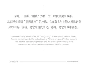
Shenzhen Haiyan Mansion Artistry Bilingual Poster
Zhuoshang Haiyanfu, Shenzhen
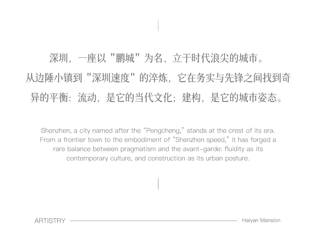
Shenzhen Haiyan Mansion Artistry Bilingual Poster
typography · minimal layout · city promotion
Elegant bilingual typography celebrating Shenzhen’s identity as a city of fluidity and architectural ambition.
Shenzhen Haiyan Mansion Artistry Bilingual Poster
typography · minimal layout · city promotion
Elegant bilingual typography celebrating Shenzhen’s identity as a city of fluidity and architectural ambition.
About this design
This clean, minimalist promotional poster uses generous white space and refined serif typography to present a bilingual narrative about Shenzhen. The Chinese text appears above the English translation, both centered with elegant leading. The layout emphasizes balance and sophistication, reflecting the city’s self-image as a place where tradition meets avant-garde innovation. At the bottom, the word 'ARTISTRY' is paired with a thin rule and the project name 'Haiyan Mansion,' creating a luxurious and restrained visual identity suitable for high-end real estate or cultural branding campaigns.
- Style
- typography
- Materials
- minimal layout
- Subject
- city promotion
Palette
How to get this look
- Use generous whitespace and centered alignment for an elegant, high-end feel
- Pair serif typefaces for both Chinese and English text to create harmony
- Maintain consistent line spacing (leading) for sophisticated readability
- Limit color palette to black or dark gray on pure white background
- Place brand or project name at the bottom with a delicate rule line