Retail Boutique Before and After Floor Plan
64㎡
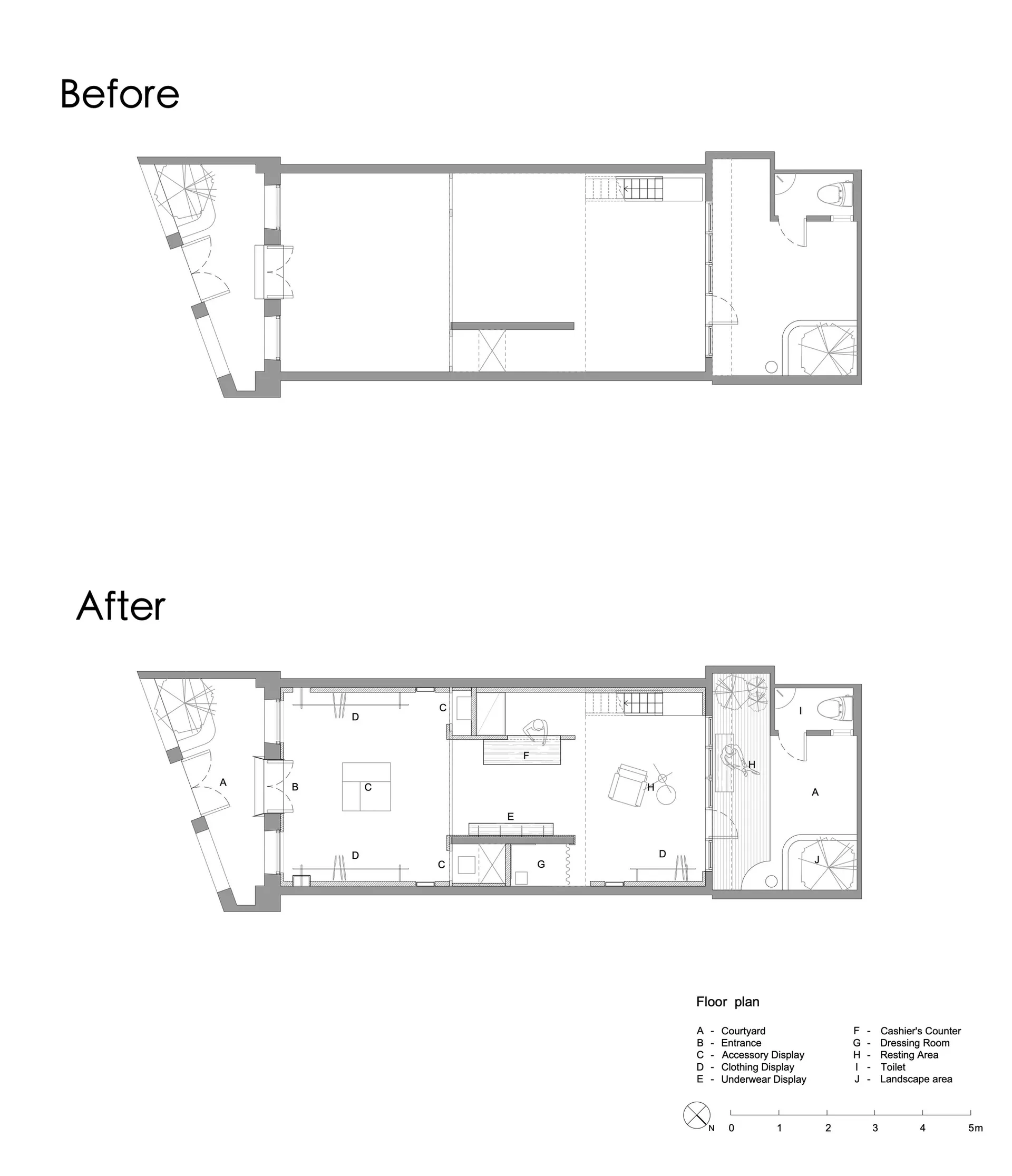
Retail Boutique Before and After Floor Plan
floor plan · architectural drawing · retail store
A side-by-side comparison showing the spatial reorganization of a narrow retail boutique from an underutilized layout to an optimized customer journey.
Retail Boutique Before and After Floor Plan
floor plan · architectural drawing · retail store
A side-by-side comparison showing the spatial reorganization of a narrow retail boutique from an underutilized layout to an optimized customer journey.
About this design
This architectural drawing presents a before-and-after floor plan transformation of a long, narrow retail boutique. The dominant palette is monochrome with varying line weights and grey tones to distinguish existing walls, new partitions, and furniture. The 'Before' layout shows an inefficient use of space with large empty areas and poorly placed circulation. The 'After' plan introduces a clear spatial hierarchy: an entrance courtyard (A), accessory and clothing display zones (C, D, E), a central cashier counter (F), dedicated dressing rooms (G), and a resting area (H). Natural light is implied through the courtyard and strategic window placements, while the overall mood is clean, professional, and customer-focused. The revised layout improves flow, creates distinct merchandise zones, and maximizes the narrow footprint. This type of plan is essential for retail interior designers, store owners, and architects planning a commercial renovation.
- Style
- floor plan
- Materials
- architectural drawing
- Subject
- retail store
Palette
How to get this look
- Use clear line weights to differentiate existing walls from new partitions and furniture.
- Implement a logical customer journey from entrance through display zones to fitting rooms.
- Create distinct functional zones using furniture placement rather than full-height walls.
- Incorporate a small courtyard or light well to bring natural light into a deep floor plan.
- Label all key areas with both letters and a comprehensive legend for client presentations.